Better scrolling through modern CSS

I am working as a professional social media manager, article writer, resume writer, LinkedIn profile optimizer with over two years of experience. I pride myself on having solid relational abilities, tender loving care, the capacity to perform multiple tasks, and unwavering quality. I am proactive, dedicated, benevolent, influential, and a quick student.
Scrollbars. A very mundane thing that every website and app has. Historically, it has been difficult to consistently customize scrollbar styling on the web. So it is understandable that frontend developers don't pay much attention to them. While it's a good thing that most of us (hopefully) aren't writing thousands of lines of JavaScript to recreate scrollbars, we should be paying at least a little more attention to them. Let's look at some of the things we can do in 2022 to improve the scrolling experience for our users.
The basics When the content of an element is too big to fit in it, we can use overflow: auto to make it scrollable. There's more to it, but this is all you need to make the default scrollbars show up.
As for styling the scrollbars, you can use the -webkit prefixed scrollbar properties combined with the standard scrollbar-width and scrollbar-color properties. There have been countless posts on this topic, so I won't bother repeating those parts. I recommend Ahmad Shadeed's scrollbar guide if you're not already familiar with these properties.
I do want to mention the postcss-scrollbar plugin that generates the -webkit prefixed scrollbar properties from the standard ones. Which means you can get cross-browser styles with just this:
.scroll-container { overflow: auto; scrollbar-width: thin; scrollbar-color: hsl(0 0% 50%); / postcss-scrollbar will add the -webkit version automatically! / }
Theming scrollbars
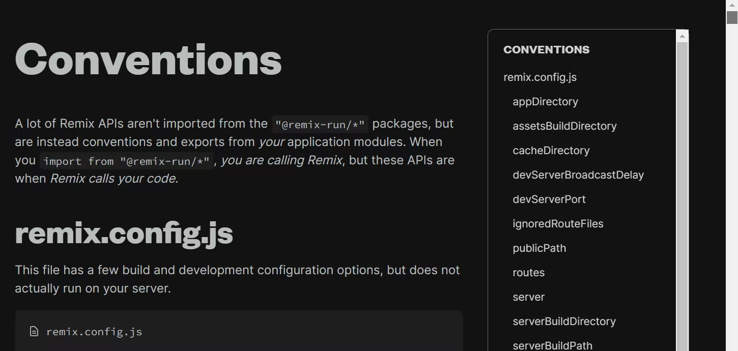
If you've decided you still want to rely on the default scrollbars, fair enough. But you need to be careful here if your site supports a dark theme. I see way too many sites implement a dark mode with their scrollbars still stuck in light mode. Here's what the remix.run docs look like on Windows in dark mode:
This can be fixed using the color-scheme property or meta tag. You should probably be doing this anyway, for non-scrollbar reasons too. Thomas Steiner has a great article on web.dev if you want to learn more.
html { / defer to OS preference / color-scheme: dark light;
/ override, assuming the theme toggler sets a data-theme attribute / &[data-theme=light] { color-scheme: light; } &[data-theme=dark] { color-scheme: dark; } }
The scrollbar quirks of various operating systems In this section, I will rant about different environments, the expectations, the behaviors, and the problems that come with them, as well as some future speculation. If all you care about is the code, feel free to scroll to the end of this section. 😅
Windows As I demonstrated in the previous section, Windows has always had some of the ugliest-looking scrollbars of any platform. Windows 10 specifically has the ugliest scrollbars in all browsers. Even if you set the right color scheme, they look too boxy and thick.
Windows 11 is attempting to modernize the scrollbars by making them thinner and overlay. This can be noticed in the various first-party interfaces (e.g. the Settings app) across the OS. As for the browsers, Firefox 100+ is already shipping it, while Edge/Chrome have it in some form behind a flag.
The Firefox implementation in particular worries me because the scrollbar is razor thin and disappears unless you're actively interacting with it. To make things worse, there seems to be no way to change this behavior programmatically. Firefox does respect the "Always show scrollbars" setting in Windows 11 but it's off by default and we can't reasonably expect most users to turn it on. I really hope this will be addressed in a future update. For now we can't do anything.
On Chromium, things are simpler: if you specify even one of those -webkit-scrollbar prefixed properties, you become responsible for providing the entire scrollbar styling. This is exactly what we want, at least until the Windows 11 scrollbars ship in Chromium.
macOS While macOS scrollbars look less offensive, they come with their fair share of problems.
The first one is a bit of nitpick but I find it super frustrating that I can't just move my cursor to the right edge of a browser window and use it to scroll. This is because macOS reserves the edges for resizing/moving the window, even if the cursor is still hovering on the scrollbar thumb. This effectively makes the already-thin scrollbar even thinner (albeit only for the viewport scroller).
The second is a more relatable problem: automatically disappearing scrollbars. They can offer a nice and clean interface... if the user knows that a part of the page is scrollable. In practice, they are very frustrating to deal with. Recently I had an experience where I literally couldn't find the ticket to a conference because it was hidden outside the scrollport and the scrollbar was invisible. In other words, disappearing scrollbars can literally cost you money. To work around this, you could maybe force the height of the scrollport to be such that the last item is half visible. Or you could use some JavaScript to detect scroll position and add a scroll shadow.
Both of these issues can be avoided by specifying custom scrollbar styling, so we should be good here.
Android, iOS, and touchscreens Touchscreen devices are interesting. They have the same thin, overlaying, disappearing scrollbars that I framed as a problem in macOS, but the usage is quite different: the user doesn't interact directly with the scrollbar and instead drags their thumb against the scrollport. Also, because the screen is usually smaller, content overflows more often and the user is expected to scroll a lot more to find content. This is also why there are special features designed specifically for this modality, such as (1) momentum-based (inertia) scrolling, and a (2) visual highlight or spring animation when reaching the edge of a scrolling container. Android is even more thoughtful about this and decides to always show the scrollbar when a scrollable element first appears, and then switch to the regular auto-disappearing behavior after the user has scrolled at least once (signalling that they are now aware the area is scrollable).
All that to say, I quite like the default behavior of these scrollbars and would like to preserve it. This is achievable using the pointer media query, which will let us conditionally style scrollbars based on whether the user is on a high-accuracy pointing device (e.g. mouse) or a low-accuracy one (e.g. touchscreen).
@media (pointer: fine) { .scroll-container { / ...custom scrollbar styles only for desktop / } }
Preventing layout shift One problem with overflow: auto is that it only shows the scrollbar if the content is actually overflowing, meaning it can cause a layout shift if a scrollbar suddenly appears. Historically, this has been possible to fix using overflow: overlay (in Chrome) to avoid having the scrollbar ever occupy space, and/or using overflow: scroll to always have it occupy space.
These days we can explicitly tell the browser to reserve space for scrollbars using scrollbar-gutter: stable. It's supported in Chrome and Firefox, and we can fallback to overflow: scroll for Safari. If you use an invisible scrollbar track, this fallback should work identically to scrollbar-gutter.
.scroll-container { overflow: scroll;
@supports (scrollbar-gutter: stable) { overflow: auto; scrollbar-gutter: stable; } }
Worth noting here is that if you want scrollbar-gutter on the viewport, it's tricky to make it work on the and might be easier to move it either to the :root or to a child.
More scrollbar goodies from modern CSS While not directly related to scrollbar styling, there are a few more properties I want to briefly mention that can help improve the scrolling experience. The wealth of tools CSS provides us today never ceases to amaze me.
Scroll padding scroll-padding allows creating an offset at the edge of the scrollport. This is incredibly useful when you have a sticky header that would otherwise cover up headings scrolled to via in-page jump links or fragment urls.
.scroll-container { scroll-padding-top: var(--header-height); } Scroll behavior scroll-behavior lets you enable smooth scrolling, which is also super neat for in-page jump links. Don't forget to guard it in a reduced motion check for better accessibility!
@media (prefers-reduced-motion: no-preference) { .scroll-container { scroll-behavior: smooth; } }
Overscroll behavior Named similarly as the previous one, overscroll-behavior does something quite different: it lets you prevent scroll-chaining in nested scrolling areas. Handy in some places like dialogs and sidebars, where you don't want the underlying page to start scrolling when you reach the end of the current scrolling container.
.scroll-container { overscroll-behavior: contain; }
Scroll snapping Introduced a while ago, CSS scroll snapping has gone through numerous improvements and patches. Today it is a fairly reliable and optimal way of building something like a gallery or stories component with near-zero JavaScript.
.scroll-container { scroll-snap-type: x mandatory;
& > * { scroll-snap-align: start; } }


